Sunday, July 5, 2020

Exploring Context and Neutrals

I struggled with the exercises for June in the Quilters Color Quest using Quilter's Field Guide to Color by Rachel Hauser. I thought they would be easy, but though I thought I understood the concepts, I had a harder time visualizing them. I guess it's good to struggle with an exercise. I'm hoping I learned something. 

The first task was to compare a swatch of a hue with others of the same hue to see how context changes the look of a color. Perhaps I should have picked values that were more dissimilar? I'm not sure. But here are some groupings I played with. 

Red

For this one I chose Autumn as my basic hue. When I compare it with the top row it looks a bit cooler to me. With the middle row, it's a bit warmer, and it looks definitely classic red to me when I compare it to the bottom row. I do see the differences, but I think I see more variations when I use fabrics instead of swatches or when I compare them to other colors.The main thing I learned from this is that in a scrap quilt with red, these would all probably work together for variation and interest. 

I also looked at blue:
Yup, I see differences between the sapphire swatch on the left and the greener and more purply hues in the group.

And yellow green:
I could see the yellower and greener look of the Spring swatch compared with each row of other colors in this one even though they are all basically yellow green.

I probably missed the point of this exercise, but I did not stress out over it and decided that I had reached the limit of my understanding of color theory, and that it was time to move on to working with fabric. 

The next exercise was picking a fabric that was a problematic one and try different fabrics to go with it to see if there was a fabric that changed the context to make it an appealing one to use. I started with a print with red, purples and tans and chose a bunch of possible fabrics:

I thought I might like blue and red, as they also had hash lines like the base fabric:
But it all looked kind of muddy. Here's what I finally settled on. 

I like it better than my other choices. The tannish claws bring out the lighter colors in the paw, and the hash marks in the background fabric relate to the other hash marks and the red, and the lighter background brightens things up. I probably wouldn't have been likely to use this fabric in a quilt (except a scrap quilt), but at least I used some of it up!

I had a piece of greenish yellow fabric and tried a bunch of greens with it. 

But I had some HSTs left over from the previous month's exercises, so why not use those? Well, of course! I think the yellow green brings out the green tones in the yellow fabric, but lets the yellow speak for itself.

Another fabric I had never found a use for was this daylily print. I tried a bunch of ideas out, thinking I might like orange or dark green. But then I found a black print.

Here's the block. (I won't bore you with all the backgrounds I tried.) 

Again, I like the blocks and learned something, I think, but part of the reason I haven't used some of them is that I've moved away from those kinds of prints (at least in my mind, not my stash). They will continue to work in scrap projects, though.

I did try one more fabric because it is one I have quite a bit of (I bought it for a quilt, and then found that it was too strong for that one), and I've been trying to think of what to do with it. It closely matches the Spring swatch from my book. Here it is with possible variations of blue and turquoise.
Probably any (or all!) of these fabrics would work. But I think the thing that was stopping me before was proportion. So I decided to use the spring color more sparingly as the claws.

I could see this in a quilt, maybe along with some greens of a similar hue but different value and a whole lot more turquoises and blues. Okay, of all the above context samples, I think this one has the most potential for a quilt someday. 

The other exercises for June were related to using neutrals in blocks: white, black, gray and brown. Keeping with the same color palette with the spring green, I tried out each of the neutrals.


I had tried several grays, and found that I liked a cooler rather than a warmer gray.

I liked all of these combinations, but the black was a bit stark for me. It would make a vibrant quilt, but maybe a little too strong of a contrast for me. The white of course is what I had used in the turquoise/spring block above. The gray was okay, but a little too common, maybe?
The one that really grabbed me was the chocolate palette. I have always loved brown, even though it has not been a generally popular color for many years. 

For the last part of the June exercises, we were to make a block, thinking about the various neutrals, but especially brown. I realized at this point that two of my blocks from the context exercise had already used white and black, so I was eager to work with brown. I happen to have a whole drawer full of browns/tans/beiges from many years worth of quilt making. Many of my dark browns have sat for as many years. They tend to have a lot of red undertones. In addition, they are ditzy prints/calicos that don't really inspire me. But there is one modern print that I just love, but have never found a use for. I think that is because I don't have other modern prints in other colors that complement it. I knew I wanted to do something with turquoise. Many years ago I had chosen exactly that combination with a mild white to make a wavy design knitted afghan for the end of my parents' bed. I tried this palette two ways for my Bear Paw blocks.

Ooh, I like this one, especially with the gray bits in the background fabric.
But this one is my favorite of all the Bear Paws I made for June:

Now THAT's a brown block I could be very happy using in a quilt these days. And I wish I had more than the little piece of fabric this came from. 

That is the sum of my June experimentation.So what did I learn?
--I kind of get context, and will continue to challenge myself to pay attention to it in future quilt projects.
--There are some fabrics that I'm probably over. Finding colors that work contextually don't make me want to use them widespread in a quilt, and that's okay. 
--I think I have the confidence now to work out something with the Spring fabric. Proportions will be important to consider. 
--I do want to explore brown more!! It will be time I think to start looking for more chocolate prints with a modern vibe. Yummy! (And to either jettison the old brown prints or use them up in something really scrappy)
--I like the idea of using a modern white/gray print as a background fabric.

I think there are lots of seeds for quilts here. (Like I don't already have enough potential projects in my head.) We are next going to go into color stories. I think I'm going to be more comfortable with those exercises. If I can find the fabrics in my stash to interpret my ideas. After working with my available stash for four months, it really is time to expand my choices by freshening up my stash with more modern fabrics.

Before I go, I'll leave you with a few flower photos from the garden and a few close-to-home bike rides. It seems that will be the extent of our vacation this year, so I'm enjoying the little things along the way. 

Catalpa blossoms; how's that for color/quilt inspiration?


Chicory--one of my favorite roadside plants


I'm linking up with Cynthia at Quilting is More Fun than Housework for Oh Scrap for this post as it's all scraps right now, it seems.I have an RSC19 quilt I just finished (!!!) to share, but this post is already too long, so that will have to wait until next week, and who knows? Maybe my other RSC19 quilt will be done by then, too! (Depends on how comfortable it is in my quilting room during our current heat wave.) Until then, stay safe!!

Tuesday, June 16, 2020

How Does Your Garden Grow?

So... this isn't a quilting post, although it might be inspirational for quilters--color, design, etc. It's really a test of the new Blogger format. I've already run into an issue. I was excited because I want to be able to write posts on my phone or ipad, but I couldn't figure out how to change the font on those, so here I am again on my laptop. Sigh. But here goes...

We finally (oh my, I have to change the font for each paragraph?) put in our annual flowers this week. We decided to wait to buy them until the Memorial Day/Garden Center Pandemic Opening was past. There weren't a lot of flowers to pick from, but we found ones that are doing wonderfully after some nice cool, dry weather to help them settle in. 

Here are a few photos I took with my phone--the ones that didn't come out blurry, anyway. I'll try some other ones for another post, if I need to do another trial post.

First up, our perennial geranium:
Ooh, that worked, and I like how I could increase the size.
Here's a close up:
And one more because I love this flower so much:
How about an adorable zinnia?
Pansies? Violas? (I can never remember which is which.) 
So far this is working pretty well. A painted daisy. These are so cute. They don't last long.
Our Maltese Crosses are kind of small this year.
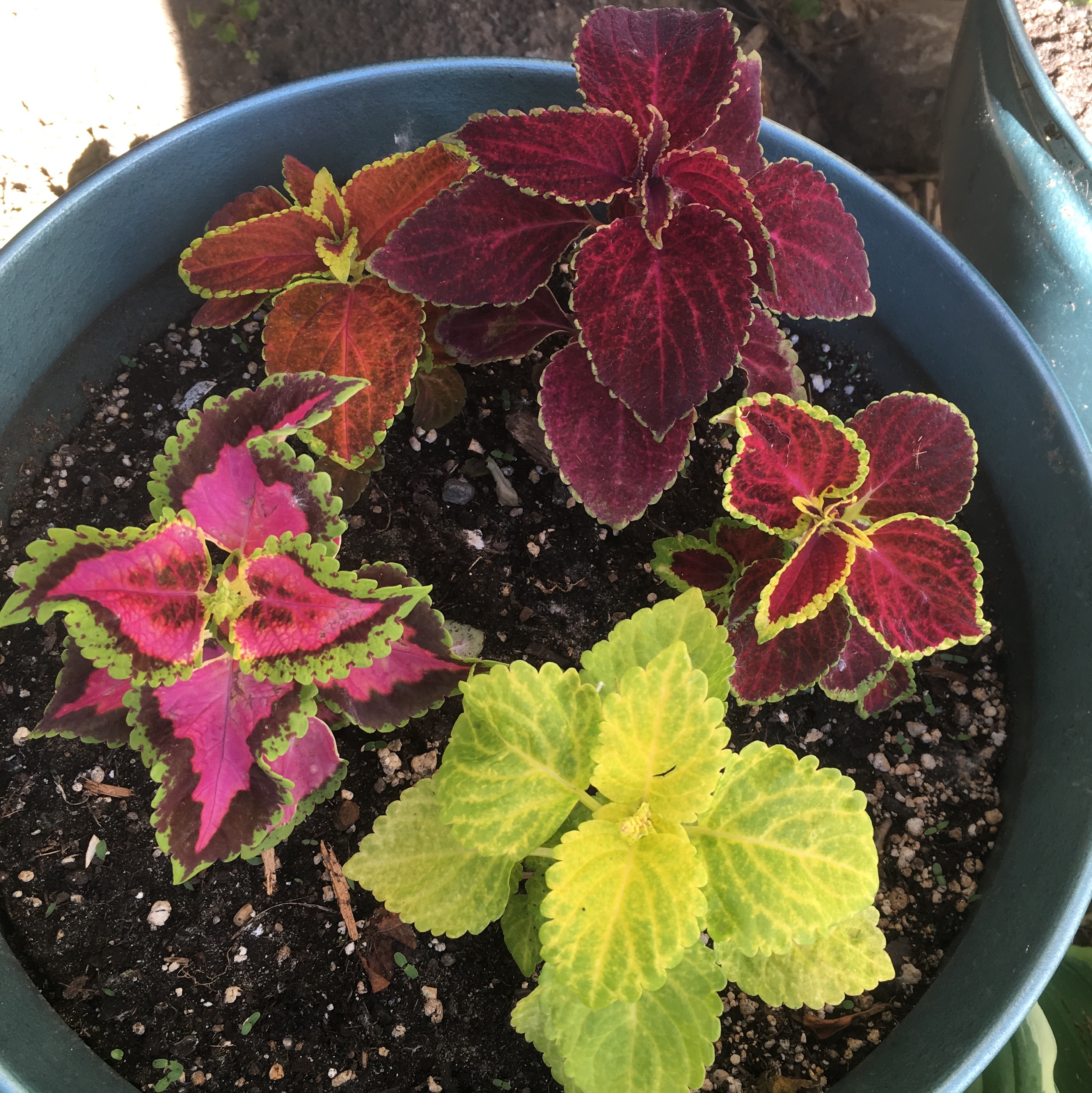
We have a few pots of coleus.
There were only two flats of impatiens left. I usually plant red, but this year I added pink because there were only a few reds and the rest were pink, so new habit maybe?
Okay, I'm going to save this and see what happens if I try to do the last paragraph and photo with my ipad. 

Wish me luck. (Do you see what I did there? I started a new paragraph and didn't have to change my font. Yay!)

Okay, here I am. Font is still there. Here’s a photo of my red impatiens. Aw shucks! It won't let me add a photo. Hmmm. Okay, back to the computer. I'll have to study this a little more. Maybe this won't work with an ipad mini? Here's the flower.

No fabric or quilting photos here. But. I did venture out to my local fabric store today all masked and sanitized, and quick grabbed a few needed fabric pieces for a project I'm working on. The store is all outfitted with clear shower curtains to keep customers and cashiers apart, and there are little tape strips all over to remind us of the 6-foot rule. My fabrics are the color of the lime coleus above. I'll share them another time, maybe when I take another crack at this on the ipad. 

So, this format is not so bad. I was able to add my photos much faster than before. I just need a little more practice finding the right buttons. And I sure hope I can figure out how to use this on my mobile devices. Much more to learn...

Aw, my font just needed to be readjusted. Oh well, I know how to do that. I hope you're having a good quilty week, and if you are a Blogger user, I hope you are figuring out this new format. If you have any tips, please share away!


Saturday, May 30, 2020

I Got Squirreled

I had finally gotten some gumption back and was quilting right along when I got squirreled. Now this is a DrEAMi post (Drop Everything And Make it), but it's not a quilting project. It's the project that pulled me AWAY from quilting for a couple of weeks. There is sewing involved, though, and if you stick with me to the end, maybe there will also be a couple of quilting photos. And this is a kind of neat family story of this strange time of stay-at-homeness.

Anyway, a few weeks ago my brother called me to ask if I could sew something for him: sails for a model sailing ship. He buttered me up first, saying that it would be easy for me because it was just like sewing the clothing I used to make. "Just cut the fabric using the pattern pieces and hem them." Well, sure I could do that. 

First, what's interesting to note, is that this ship is a model my dad bought about 25 years ago as a project to fill a difficult time in his life when my mom entered a nursing home in a new city, and he moved from their home to a condo near my brother's home and Mom's care center. The model is the Bluenose II, a Canadian schooner that was built in 1963 to celebrate the original Bluenose, which was a fishing and racing schooner, I think, built in the early 1920's.The Bluenose II is still in use to celebrate the maritime history of Nova Scotia. You can read about it at the schooner's website. The model was a product of a company called Artesania Latina, which I think is no longer in business. Dad built the hull, tiny board by tiny board. When he got to the rigging and sails, he quit. For years, the ship sat on a table in his basement. Recently, my brother took it home, thinking it might be a good project to work on someday during retirement. He didn't get around to it until life as we knew it shut down. Suddenly, he had all kinds of time on his hands. Someday had come. 

So let's look at the boat as he started working on the masts.


More rigging:


 And then here is where I came in. So the package arrived in the mail with the pattern, instructions, "sail" cloth, and little coil of rope. I wish I had taken a photo. The envelope was all wrinkly, like it had been sprayed with something. Disinfectant, maybe? The tape that sealed it was totally loose except for two inches at one end. I do know the postal service between our two cities was going through an especially hard time, so who knows what happened. Luckily, a check with my brother indicated that there was nothing missing. 

And the instructions. Oh, wow, the instructions! It's a good thing I did not see these before I agreed. But you know what? My brother did charm me. Oh, yes he did. He followed those instructions to the letter. The underlined parts are what I was to do. But read the whole paragraph. (The little side note is his.) Yikes!


So anyway, initially I thought I was cutting out sails and hemming them. But then more was revealed. I'd have to sew little parallel lines on each sail to mimic the seams of real sails. . Oh, yeah and then I'd have to sew a tiny rope around each sail. By hand!. And everything was tiny, tiny. What had I gotten myself into?!!

Here's a drawing of the sails:

And the pattern:

The first thing I did was search for thread. Remember, this was during stay-at-home orders, so I had to work with what I had on hand. I auditioned some and sent my brother a photo for his input. 

The Superior Masterpiece thread in Granite on the right was a perfect match for stitching the hems. It's a fine thread, so that was good for the scale of the project, too. The rope on the left is an olive-gray. I had just the right color in a hand quilting thread to match it. At first my brother said he wanted thread to match the sails for the parallel lines, but by the time he sent the package he said he had seen a photo of a model online with black for the lines that he liked better. Well, of course he did because that would be a doozy to sew straight (ha!). I laid out some black and gray all-purpose thread, and then a variegated gray quilting thread that I had left over from a project (Superior King Tut in Pumice). I thought the black was too stark. My brother chose the King Tut. Yay!

Using a scrap, I made a practice hem to see how it would work out. The instructions were to double-fold a .5cm (that's two folds of 2.5 mm!!) edge and top-stitch to hem. The good thing was that the fabric was crispy, so it held a pressed edge well, but it was also ravelly. I was able to stitch the tiny hem, but could not see myself in that much stress for all of them with the threat of everything raveling. So instead, I added a bit to the seam allowance and carefully traced and cut out the sails (there was no room for error as the fabric piece was about the same size as the pattern). My finished seams ended up being a tad over 1/8 inch, which was just fine with my brother, although a model ship builder would probably be appalled at the scale.
 After I hemmed the sails I laid each one out on its pattern piece and traced the "seam" lines on the sails with a fine mechanical pencil, as I knew there was no way I could get straight lines by eyeball or with a seam guide.
Sewing all those lines was a slow task. I had not realized it before, but sewing through just one layer of fabric is a different kind of sewing. When you sew two (or more) layers together, the intertwining of the top and bobbin threads happens in between the layers. With a single layer of fabric, there is no place for that to happen. I had to turn up the top tension all the way on my machine to get the threads to lay straight on both sides of the sail--important, as in a model, the ship can be viewed from both sides. And, again because of scale, the stitches had to be very tiny. I had to rely on my trusty seam ripper to take out some lines when the tension failed. I also had to take apart the tension mechanism on my Featherweight several times to get it working properly again. Thanks to multiple videos online I was able to do that, but my machine is finicky, and often the numerical dial didn't want to seat. The definition of insanity is to do the same thing over and over again expecting different results. Well, I was insane, but it worked and eventually, after a lot of sweating and thinking,"Oh, no, I've wrecked it, and now I have to get it repaired, but the repair shop is closed for who knows how long," the mechanism would pop back together. Whew. Now I know my machine a whole lot better. 
Pay no attention to that 6 on the dial. The tension dial was actually turned all the way tight. (This was before I had taken it apart and adjusted it. Now my numbers actually match the tension, but if you know Singer machines, you know that's just arbitrary anyway.) The lines look a bit wavy on the crispy fabric from this angle, but they are straight enough when you look at them straight on. 

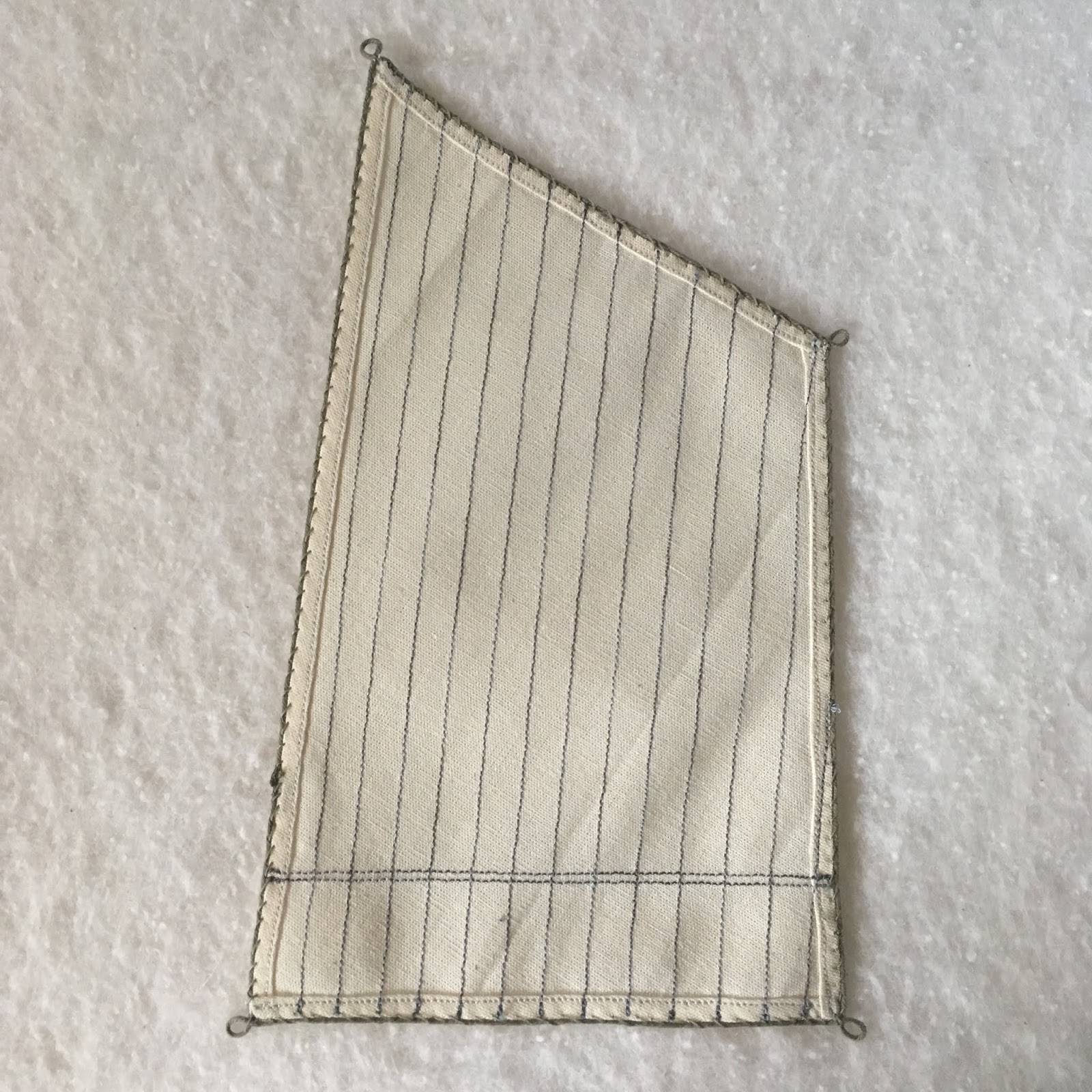
Eventually, the sails were all hemmed and lined:
So far, so good. I had to work up my courage for the next step--the hand sewing to attach the bolt ropes with eye splices to each edge of all the sails. (Yes, I do know some ship terminology now.) I started with a sample piece again. (Photos are ones I sent to my brother for his approval of the process.)
I had to whip thread around the edge, piercing the rope to keep it in place, but also allow enough room for tiny rings to fit through to attach the sails to masts and other things (that I don't know the names of). I also tried lashing the ends of the rope together, but it was really too thick to suit me so I tried other means of joining them when I actually sewed them to the sails--mostly stitching them just past each other with a dot of glue to keep them from raveling.The eye splice is that little loop you see at the corner that gets attached to ship parts (no, I don't know the term) by lines (no, I don't know the term for those, either).

Here is the other side:

The stitches are a little more angled, but they are consistent, so I think it's fine. I have since thought of a way to do that stitching that would be invisible, but I think I'd still be sewing these if I had used it. 

And one more view with a paper clip standing in for a ring to make sure there was enough space to attach the rings:
Once I had that done, I worked several hours a day for a week--I kid you not--to do this tiny stitching. I quickly found that I needed to do it in natural daylight. My tired old eyes could not do the job in lamp light. But it got done. Here are all the sails, along with a flag. 
Oh, yeah, the flag. That was just one more teensy project my brother came up with. There is supposed to be a Canadian flag on the ship, but since we had been working on this project during stay-at-home time, he decided on a quarantine flag instead. He had printed out a paper one, but could I maybe make a fabric one? Hmm. A sewn flag would have looked more like a quilt. Too bulky. So I scrounged around and found a scrap of fusible web and just fused tiny squares of fabric scraps (yup, I've got those) together so that it would look like a proper flag from both sides. I was beginning to think my part of the project would never end! But it did!! And I'm pretty proud of my part of it. 

Here's a close-up:

And more sail shots:


And the back of one:
Because of the condition of the package when my brother sent me the sail materials, he was not comfortable with having me mail them back to him. One morning, feeling antsy with staying at home, he called and said he was going to drive out to get them so he could finish the ship. We had previously talked about meeting halfway, but I was not comfortable leaving my house without a way to stop at a "comfort station" if I needed it on the way. So denying himself coffee so he wouldn't have to stop (see, you can talk about any subject during a quarantine), he drove nearly 90 miles from his home to pick up the sails on my front porch. We visited through the front door glass for a few minutes and then he turned around and drove home. (Wish I had thought to take a photo.)

He sent me progess photos of attaching the sails to the ship, which I think was probably as much work as making them. 

After attaching the first three sails, he decided to keep one furled to make it a little less cluttered and maybe more exciting. 
More sails:


And done!! 
I think the last sail is furled behind the others.
So there you have it: my squirrel project during quarantine. Well, actually, our squirrel project, but I don't think my brother knew it was a squirrel. An amazing amount of work! Now I really appreciate what all goes into making a model. When I was a kid, my dream was to build a miniature doll house. (I think that dream came from seeing the fairy castle at the Museum of Science and Industry in Chicago.) I never got around to it (except for a cardboard one that got destroyed in a minor flood in our basement when I was about 11 or so), but I have to say I'm still fascinated by miniatures. I'm not into ships so much, but the idea is the same, right? Building something tiny with as much detail as possible to resemble the real thing. But my eyes are not what they used to be, and while I learned a lot about making model sails, but I doubt I will make them again. I also realize that the doll house dream is just an appreciation now. 

If you've been keeping track, you know now that my father, my brother, and I have all had a hand in this project. But there's more. The sewing machine is the one my mom got second-hand when she married my dad nearly 69 years ago. She left us more than 22 years ago, but her Featherweight is still my primary sewing machine. So this was truly a project that our whole family had a part in. Isn't that wonderful? 

It was fun texting back and forth, sharing photos with my brother, and keeping my dad up-to-date on the progress. And then, actually finishing a model started so many years ago! I wonder how many hours we spent in total. Mind-boggling, probably. My dad is thrilled. Of course, being practical, he says he's just glad it's done because he "paid a lot for it." It's on display at my brother's house for now. Maybe when we are all a little freer to move around, my dad can show it off at his condo. He did get to see it during a physically-distanced quick peek.
I'm linking up with Sandra at mmm! quilts for DrEAMi (Drop Everything And Make it) even though it's not a quilt. Hey, it was a squirrel after all, and does relate somehow to Canada, too, so I think she'll be okay with it. And once I got these sails done, you can bet I went back to quilting with a new appreciation for those big (ha ha) quarter-inch seams. I even got two tops together, and one of them basted. Here are just a couple of peeks at those. 


I'm wondering what's got you distracted these days. There's plenty to distract. But I hope it is something good, and maybe even something quilty.

(Just a reminder: I'm not affiliated with any company, so when I mention products, services, or stores I'm just documenting what I used or liked.)