Showing posts with label baby quilt. Show all posts

Friday, January 5, 2024

A New Baby Quilt

Our new great-nephew is here, so I can finally share my adventure from the last few months. Here's a sneak peek.


And the story:

We knew this baby was coming for quite a few months. He was a major surprise for his parents after a long journey of disappointments and grief and letting go of a dream. From the time I heard that he was on his way to our world, I was excited to make one more baby quilt for a great-nibling (new word to me--I had to look it up). 

Around August I was ready to get started. I checked in with my niece, and she said she might be decorating the nursery around a piece of Australian artwork that her husband had bought years ago. While I was on vacation I saw an Australian line of fabrics and bought a few fat quarters for inspiration. After I got home, I kept fooling around with them, but they just wouldn't tell me what they wanted to be. Meanwhile, my niece sent me a photo of a rug with bold geometric shapes that she was looking at for the nursery. (You can see it here if you want to.) Without a second thought about what the words "looking at" might mean, I pushed aside the uninspiring fabrics and jumped in with both feet (and hands), looked up the rug online, and designed a quilt based on some of the shapes and the colors in the rug. You know how quilters are, of course you do. We have to get making. I was inspired.

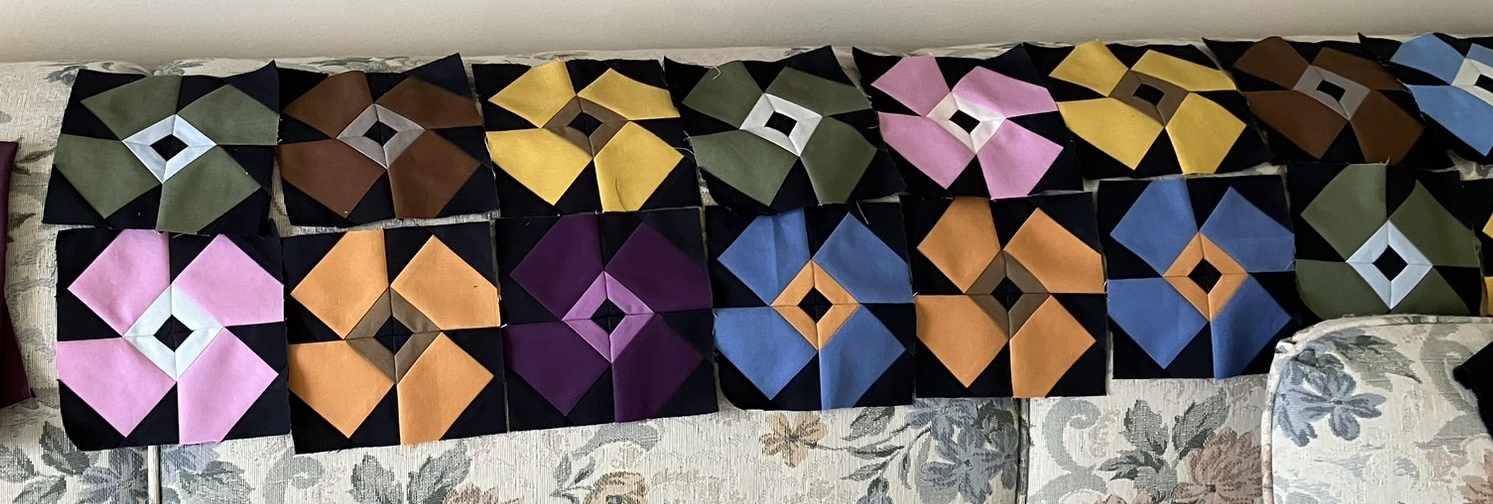
I even made the rounds of the local and online fabric stores to gather the fabrics to bring my design to life. And then I got to work. Here are the first blocks I made, and they are still my favorite ones. 


More blocks followed quickly--I was in the zone.


Until I had quite a design wall full of them. (Excuse the blurred photo--we were having a string of dark days, which were not kind to photography.)


I constructed the quilt in batches of like blocks. My original color scheme was taupe, yellow, orange, turquoise, blue, navy, and snow, with a bit of gray. Early on I focused mostly on the blocks with taupe, yellow or orange. This was moving along fast. Until I got a message from my niece. The geometric rug just wasn't working out. Ulp! She had decided to go with a navy blue rug. Well, that would still work. But she had also decided against the artwork.  And she was looking at some wallpaper with sharks and whales in it. Can you hear the screeching tires? Stop the quilt making. My color scheme was wayyyyy off. Two days later I had a new color scheme in place--never mind that my niece was still "looking at" the wallpaper. 

I replaced the orange with dark red (there were some sharks with open mouths in the wallpaper), and the yellows with more blues and gray, and added some blacks to the navies. The taupes would still work. Then I set everything aside and went on vacation for a week.  After I got back, I made myself wait just a little longer, and made some placemats instead of jumping back in on the quilt. Then I unsewed all of the yellow and orange parts of the blocks--not nearly as fiddly a task as it might seem. 

Near the end of October, I checked in with my niece. She had ordered the wallpaper. Yes!! Back to work full steam.  I started by sewing all the reds in place of the oranges. I did make new quarter-circle blocks. That seemed faster than resewing the old curves. 
Another dark photo, I know. You can see the page I printed of the wallpaper. The actual wallpaper has much larger sharks and whales, but I was using it as a reference for colors. I did a little extra shopping locally for more blues and grays, focusing on fabrics with subtle patterns that seemed to me to look sort of like shark or whale skin and water. I know they look solid here.

More block parts up on the wall. It got to be a messy process but moved ahead quickly. 

And just like that, a top, ready to baste.


So, lets look at the finish, shall we, and then I'll talk about the quilting and back...


For the quilting, I decided on wavy lines with my walking foot. I started in the middle and worked toward the top. The waves got wavier and wavier as I went. Yikes. Then I went back to the middle and worked toward the bottom. I tried and tried to get wavier to mimic the upper part of the quilt, but no matter what I did I just couldn't duplicate that design. So instead, I intentionally made the waves flatter and flatter. No sense fighting the quilt. I'm going to call it a design element. There are currents in the water at the bottom of the ocean and waves at the surface, right? That's my story, and I'm sticking to it. 

Here's a bit of a close-up. 

And my initials/date.

And the back.


I've had this Joel Dewberry woodgrain print for quite awhile. I had bought 4 yards of it thinking it would make a good back someday. Well, here's someday. I was thinking "boardwalk" for this quilt, because my niece's family lives on the west coast near the ocean where there is a long boardwalk. Never mind that the boardwalk where they live is cement. I was hoping that maybe there was a wooden pier. (It turns out their pier is wood. Yay! I found that out after I sent the quilt.) It needed some pepping up, so leftover water colors worked just right for a band across the top. For the binding I combined leftover navy prints. 

Here's a close up of the back.  


And here are the stats: 

Pattern: My own, inspired by a geometric patterned rug, and designed with the Quiltography app.

Block size and piecing: 8 inches finished. No-tear paper foundation piecing wherever possible.  

Size: 56 1/2 inches square before quilting. 55 3/4 by 56 inches after quilting. (I trimmed the quilt about 1/8 inch bigger before binding to try to keep the block points intact as much as possible with 3/8 inch binding.)  52 3/4 by 53 inches after washing.

Fabrics: Wide variety of subtle prints and a bit of Kona snow.

Batting: Fairfield 80/20

Thread: Superior Masterpiece in Granite for piecing; Coats and Clark quilting cotton in Nugrey for quilting and machine part of binding; Superior Treasure in Antique for hand binding.

Machines: Singer Featherweight for piecing; Singer 115 Treadle for quilting and first seam of binding.

 After I washed the quilt, the light was good in the guest room to see the prints, quilting, and texture. So here are the glamour shots. It's too grubby outside this time of year to go on location anyway.


This quilt sure came a long way from first idea (busy Australian prints that I didn't show you but are now stash enhancers) to yellow and orange brights (also now stash enhancers) to moody ocean colors (mostly used up). Perhaps it is a lesson in "look before you leap," but honestly, the whole experience was fun. And I'm just a bit tickled that the design worked by just tweaking the colors. And it's kind of funny that it was inspired by a rug that is no longer relevant. I hope Baby J and his parents (and big sister) will enjoy it for a long time. 


I hope you have or have had the opportunity to make a baby quilt for someone. It's such a joyful gift to make. And whether you look before you leap or not, I hope all of your quilting adventures are as much fun as this one.

(Just a reminder: I'm not affiliated with any company, so when I mention products, services, or stores, I'm just documenting what I used or liked.)


Thursday, March 16, 2023

Baby N's Quilt

Oh my. It has been a very long time. I mentioned at the end of December that I had a baby quilt to make. I really thought I could finish it by the end of January, but my quilt construction pace was as slow as...well, molasses in January, I guess. But the quilt is done, baby has come, and gift has been given, so I can finally share here. (I did do some other sewing in the meantime, and will share shortly.)

Let's just jump to the end and then we can back up a bit--or a lot. 


So, the inspiration for this quilt came from my niece's photo of the nursery--and especially-- the beautiful rug. 


She said she was not all that fond of the pink, but that she liked the moodiness of the other colors in the rug. She also expressed a preference for solid fabrics over prints. I loved the idea of solids and moody colors, but I will admit that for several weeks I was stymied. First of all, I was not at all sure of the actual colors in the rug. With a little research, I found it online on a store's website and printed out the photos that became my basis for choosing colors. I was still uncertain, though, because I noticed a strong LED lamp in the baby's room. I have struggled to transition to LED light in my home, and have been highly aware of how the differences in daylight, incandescent, and warm or cool LED light can affect color. I spent hours  days shifting my Kona color chips around along the edges of one of the photos of the rug. 

While all of this dithering was going on, I was also trying to figure out a pattern. I wanted it to be kind of simple so that it wouldn't fight with the rug. I tried a lot of ideas--a strong contender was nine-patches with solid squares based on an old Amish quilt, but I just couldn't get the gradations of color to fit my vision. Then I started playing around with the flower block from the free Floret Table Topper tutorial from Cluck Cluck Sew. After studying the inspiration rug, I knew that I wanted just a bit more variety of color in the block so I added a little strip in the center of the flower and drafted a paper foundation pattern that would finish at 5 inches. Using my Quiltography app, I laid out a bunch of flower blocks, but the design quickly became too busy for me, so I sprinkled them around and added bars and vertical sashes between. I experimented with a light background, but the colors looked too bright, and I realized that the quilt really needed both black to keep the colors looking moody and pink to lighten it up for a baby. I tried out two designs with my app. In one, the bars were all rectangles and in the other I threw in some triangles, like this:

This design was just a general guide. I knew I did not want regular horizontal sashes, but my app did not allow me to eliminate them. I combined both designs to make the bars as irregular rectangles or blunted triangles (yes, thanks to my math teacher dad I know those aren't the right terms, but you know what I mean). I also reversed the direction of the flower petals from my plan so they would spin forward.

Gradually I narrowed the colors down to ones that I hoped would at least complement the rug. Just before Christmas I ordered a bunch online from a new-to-me store in Ohio because my local stores only have the basic set of Kona colors. Those fabrics came in just a couple of days. Maybe they thought they were a present? Anyway, I'll shop there again.


I had no idea how much fabric I needed, so I bought a bunch of quarter yards, a few half yards, and 2 1/2 yards for the background fabric. The background is Kona Pepper rather than Black to lower the contrast just a smidgen. I could not find a Kona dusty purple that I liked (I don't have the lastest Kona swatches, so I don't know if the color even exists), but I had a couple of scraps of dusty purple tone-on-tone prints that were just the colors I wanted on their back sides, so I added those to the mix. The purple I did order was a Moda, but it was a little too strong, and I didn't use it.


I made the flower blocks first. So much fun! I used freezer paper foundation piecing for the quadrants to make them nice and crisp and accurate. 

That was the fast part of the quilt, but the whole design turned out to be more complicated than I anticipated. I wanted to sprinkle colors around so I had to be careful of how I used each one. I also decided to foundation piece the bars to keep measurements accurate. I made patterns from graph paper


and planned to piece them no-tear style with freezer paper. I made patterns in three different lengths, that could then be varied by reversing them and/or turning them 180 degrees, I made additional copies of the patterns on freezer paper that I could use as rough templates for less fabric waste as I pieced. 

I put the flowers up on the design wall in the approximate placement in my quilt plan. I would plan each strip, press the freezer paper template on, cut out the bars and foundation paper piece them, put the strip on the wall, and plan the next one. Here's how I planned each strip with folded fabric (using black construction paper to stand in for the black fabric since it was easier to use than handling a big piece of fabric). 


And up on the design wall...

All went well at first. Then I started pulling the freezer paper off sections, and a mild disaster happened. There seemed to be too much adhesion (or maybe too loose a weave in the fabric?) and my fabric started to fray. That never happened before. I ended up having to do surgical repairs, replacing several bars that were too frayed to be salvageable. I stopped using the freezer paper and used newsprint for the rest of the quilt, still using the no-tear (and no-tears) method. Sure glad I pulled off those sections before too much of the quilt was made and damaged. One other goof-up happened when I accidentally grabbed a piece of black fabric instead of pepper. More surgery was required. Good grief. But after all of the strips were done and I had inserted black vertical sashes, I was thrilled to see that the quilt was looking like I had envisioned it.

While I was doing all the sewing, I kept wondering what I was going to do for a backing. Long before I started planning this quilt, I had seen a wideback fabric at my local store. In fact, I liked it so much I had almost purchased it. When I started sewing the quilt I realized that the backing colors were sort of like it. I kept visiting the backing, and finally decided to buy it even though I wasn't sure if it would work. Then, whenever I was working on the quilt, I'd lay it out with my copy of the rug photo on the ironing board, trying to picture how it would all look together. 

Silly, no? I was still worried about how the quilt would look in all the different kinds of light. But, as you know, in the end I chose that backing.

Finally the top was done, and it was time to figure out the quilting. I really liked how the top looked and although I tried drawing all sorts of quilting plans and laid thread out in different ways, I just couldn't figure out what to do. Meanwhile, the baby's due date was getting closer and closer. Finally, I decided to just quilt in-the-ditch (-ish) everywhere and let the quilt pattern be the pattern. 

That might be my one minor regret. If I were to do it again, I think I'd stipple it. There were LOTS of threads to tie off and bury. I also dithered about thread color. I didn't trust my machine to quilt with a darker thread on the front and lighter thread on the back (I didn't want light threads "poking through" like little specks of dust). So I choose an olive green thread for most of the lines and blue for the lines on the flowers. They didn't look that different from each other, but allowed me to not play thread chicken with one of the colors. They showed like a dark gray the back, but I don't mind. They make their own pattern over the flowers. Here's how that looks:


And, can I say I'm really proud of how straight I got that backing? My vertical thread lines are almost spot on with the floral pattern. 

When I finished the quilting, I was pleased to see that I had enough fabric bits left to make a pieced binding. Here it is all laid out to make sure the seams wouldn't fall at the corners. (How about that sunshine?!)


Stats: 

Pattern: Flower Blocks are inspired by Cluck Cluck Sew as noted above. The rest of the pattern is my own design.

Fabrics: Kona solids in Amber, Ballerina, Ballet Slipper, Bison, Bluejay, Cloud, Curry, Denim, Desert Green, Dill, OD Green, Pearl Pink, Pepper, Sable, Sky, Smoke and Violet (there might be a couple of these that didn't make the final cut as I was sewing), plus two old scraps of who-knows-what from my collection. Hillside Meadow wideback from Art Gallery Fabrics.

Batting: Fairfield 80/20.

Thread: Superior Masterpiece in Granite for piecing;  Mettler Silk Finish Cotton 50 wt. in Smoky Blue and Burnt Olive for quilting; Superior Treasure in Antique for hand sewing the binding. 

Size: Pieced: 54 1/2 by 54 1/2 inches
         After quilting: 54 by 54 1/4 inches
         Washed: 51 by 51 1/4 inches

         
                                    A bit windy after washing

Machines: Singer Featherweight for piecing; Singer Treadle 115 for walking foot quilting and for machine work on the binding.

It felt so good to finish the quilt. I sent it out along with a little present for baby's big brother as soon as we received word that baby had arrived. It made it to Chicago in one day and was almost at its destination when my tracking notifications indicated an error and then completely disappeared for a day. The next message indicated that it was at the wrong postal facility not far from where it needed to go, and there it sat for several days with no word at all. It seemed it was no longer "Priority." I was really sweating it out, picturing it in a pile in a forgotten bin or worse in a corner somewhere with rats gnawing on it. After five days, the package was declared officially late, so I opened a complaint case to get it moving again. (Sometimes I think the post office needs to hire special "Moms" to look for lost things when technology fails.) Fortunately, things got back underway, and the package finally arrived. Whew! 

The gift received:

And the tiny giftee:


I will admit to a few challenges when I made this quilt, and at one time I wondered if it meant that this little girl would be a feisty little soul. But she's adorable and chill. And all those challenges gave me more time to meditate on her and her family before she was born. I hope there is a baby somewhere in your life that you can gift with a quilt. It's really a satisfying project. 

 
I'll be back next week with another finish that's been waiting for a post.

(Just a reminder: I'm not affiliated with any company, so when I mention products, services, or stores I'm just documenting what I used or liked.) 


Wednesday, December 11, 2019

Baby M's Chicago Skyline

Get ready. This is a long one. Because, you know, one of those secret projects that couldn't be revealed. Until now. Baby's not here yet, so I don't really know his initial. M is from his last name, but the baby shower has happened, so I can share. Yippee! 

This all started with a question to Baby M's parents about colors and possible theme for a quilt. They said the nursery is neutrals, with tan walls, black and white furnishings, and pops of color for decorations. They also said maybe buildings for a theme, since they have lived in some of the largest cities of the country. They currently live in Chicago, so I took that theme and ran with it. Here it is: my sort-of Chicago skyline--an abstract, with some well known buildings and the elevated train (the "L"), not necessarily where they are really placed, but in an arrangement that pleased me.
All washed--looks wobbly, but that's just from the hangers and breeze.
So now that you've seen the big reveal, I'll share lots more photos, with a visual tour of the process.

I started with the fabric you can see at the bottom of the quilt and in the backing here:

Here's a close-up:
It's from the Robert Kaufman Let's Go line. I found it online and was immediately smitten because it was in colors I was looking for and even more important, the cars, trucks and bicycles were all in the right orientation for a city street--no upside-down vehicles--so they'd fit perfectly at the bottom of a row of buildings. 

After looking at oodles of photos of the skyline of Chicago with labels of major buildings, I drew a plan on graph paper. 

You can see in the photo above that I've labeled and listed some of the buildings. The numbers at the bottom are planning for the amount of yardage for the vehicle and background fabric. I think. I can never tell from my scribbles. While waiting for my fabric order, I colored in the drawing and started planning the scale and piecing (those numbers are along the side of the photo, with each square of graph paper equaling 2 inches). The numbers along the bottom and in the body of the quilt drawing correspond to buildings and background pieces, which I may or may not have attended to while actually piecing. 

When the vehicle fabric arrived, it was time for a trip to the fabric store for fabrics with building-ish prints and colors that coordinated with the vehicle fabric. I was thrilled with my finds. I had a few pieces in my stash that worked, too, so in no time, I was all set to dive into piecing. 


I started with the Willis (formerly known as Sears tower) section of the quilt. There is another building in front of it (Board of Trade--the gold one) and to keep things easy where there were tricky seams, I freezer paper pieced parts of them where they overlapped.
 Here's a close-up of the front of that part:

And that section, finished:
 Then it was time to plan the next section:
I planned window color and placement.
Those copies to the left are just to cover the fabric.
And another section done:

It took a little time to plan the next section of the quilt. I had trouble at first getting the proportions of the windows of the CNA building (the red and white one) the way I wanted at first, and I did redo some of those seams to make the windows narrower. I also had to plan that building so that I could later fit the "L" in, which required some partial seams. I designed the building so I could remove a few stitches to insert the L train during the last phase of sewing.
Headed to too much white
Better
Ready to move on
Moving on, I forgot to take some photos, but all went well, with more freezer paper piecing where buildings overlapped.

The last big building was the John Hancock, recognizable for it's distinctive X's in the structure. I tried out several blackish/grayish fabrics
but suddenly realized that the blue/teal print was the perfect value and repeat of fabric use. I again used a slice and insert method--combined with freezer paper piecing to keep it neat.

Then it was time to add the L train and do one more slice and insert of the rail. Using the 1/2 finished rail kept the integrity of the building design--no windows or structural elements were distorted. And the last step was adding the street at the bottom. This whole process was so satisfying, and I'm thrilled that it turned out as I envisioned it. 

For the quilting, I stitched in the ditch (-ish, I sometimes get a little off seamline) around each building, and then followed windows, quilted abstract windows and other building-ish lines. In the background (both the street and the sky) I did long wavy horizontal lines. Chicago is The Windy City, but I wanted just a decent breeze.

Here are the Stats, and then I'll finish with some close-ups:
Pattern: My own graph paper doodle based on photos of the skyline of Chicago.
Fabrics:  A variety (sorry, I'm not good at keeping track of them) plus the car print from Let's Go by Robert Kaufman.
Batting: Hobbs Heirloom 80/20 
Thread: Superior-- Masterpiece in Granite for piecing; King Tut in White Linen for quilting. Unknown black hand quilting thread for stitching binding to back.
Binding: 2 1/2 inches cut, double layer, machine sewn to front and hand stitched on back
Size: 56 3/8 inches tall by 52 1/4 inches wide. 54 inches by 50 inches after washing.
Machines: Singer Featherweight for piecing; Singer Treadle 115 for walking foot quilting.

So, now, some additional photos taken indoors (on our bed) because the weather is dark and yucky.
The major buildings from left to right are:
311 S. Wacker (green check)
Willis Tower (formerly Sears Tower--black squares)
Chicago Board of Trade (gold plaid) 
CNA Center (red/white--the real building is distinctively red)
Either Chase or One Prudential Place (I never did decide, although it lacks the top of Prudential, but it's the teal one with blue windows) 
Two Prudential Plaza (the navy one with the pointed roof) 
Crain Communications (formerly known as the Smurfit-Stone--shorter red building), 
Aon Center (gold with long gray windows)
John Hancock (black with X structure)
And then, of course, the "L" train and track


Blogger insists on turning this photo sideways. Oh well.


I hope you enjoyed seeing this quilt as much as I enjoyed making it. I think graph paper is my favorite way to plan a quilt and seeing this quilt come to life from the paper was such a satisfying experience. Perhaps it will inspire you to interpret a favorite skyline as a quilt. I hope the little guy this quilt is meant for will have fun with his own version of "I spy" with the buildings of Chicago. He even has an awesome skyline view from his nursery window.

I'm linking up this week with Kelly at My Infatuation for Needle and Thread Thursday, Sarah at Confessions of a Fabric Addict for Whoop Whoop Friday, at Wendy's Quilts and More for Peacock Party, and Michelle at From Bolt to Beauty for Beauties Pageant.

(I'm not affiliated with any company, so when I mention products, services, or stores I'm just documenting what I used or liked.)