
For a complementary scheme, here's my pairing of blue-green with red-orange (or teal and papaya/coral):

And then, triadic, with blue-green, red-violet and yellow orange (or teal, boysenberry, goldfish):


After that initial dip into the color wheel, we moved on to a full wheel for the next exercise.
Here is my attempt to arrange the basic color swatches with all the ones in between:


And then the blocks:

Isn't that a fun way to make a color wheel? I didn't sew my blocks together, as I have other plans for these eventually. How about a closer look with the labels?

 |
| Autumn, Peony, Boysenberry |
 |
| Tiger, Pineapple, Lime |
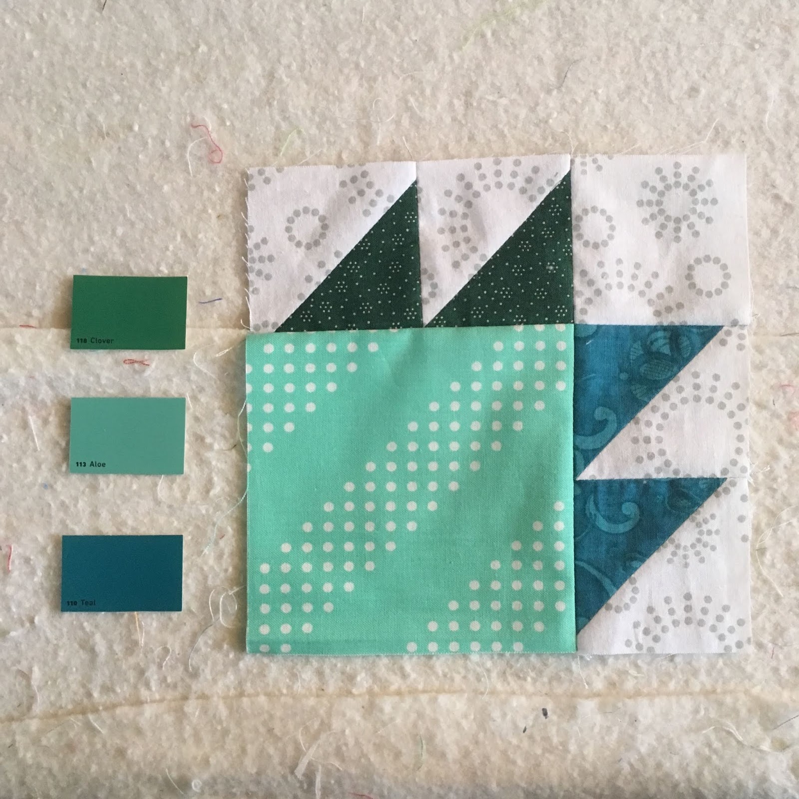 |
| Clover, Aloe, Teal |
 |
| Cornflower, Bahama, Blackberry |


I ended up making four jewel blocks.

Top right: Iris and Sunrise
Bottom left: Ruby and Hunter
Bottom right: Ruby, Olive and Denim
I did try to follow some of what I learned about pairings from the first color wheel exercise, but mostly I just had fun with it. I think my biggest challenge (problem? opportunity?) was the limitations of fabric designs/color I have available. It turned out that my favorite of these blocks is the bottom right one above. I paired a modern print with a tiny, very old sprig print that I would never have thought to do before I made this block. It somehow works!
Okay, if you're still with me here, one more exercise: a simple one focusing on variations in value with a monochromatic color scheme. I really enjoyed this one, and am tempted to cut up all my bits of fabric into a zillion Bear Paw blocks just following value. First I took a photo of all my swatches and turned it into grayscale because I have a really had time detecting differences in value without doing that.

Then I made four sets of monochromatic color schemes. (We only had to do one, but I'm an overachiever. Ha! Or maybe just having fun.)


Top left: Pistachio, Seafoam, Apple Green, Moss (I tried to mix warm and cool greens.)
Top right: Ice, Surf, Sea Turtle, Teal
Bottom left: Cloud, Sky, Peacock, Mineral
Bottom right: Buff, Orange, Flame, Cloves (I do like that orange one. I have lots and lots of rust from back in the olden days. Maybe I can resurrect them with some lighter oranges in a quilt someday.)
And here they are in gray:

So, whew! Those are my workshop exercises for the month. I was going to add a couple of photos of other things I'm working on because I actually have two(!!) RSC19 quilt tops finished. But this is plenty long enough. I'll share those soon.
I hope you have had a good weekend, and if you are in the US, I hope you are having a wonderful extended Memorial Day weekend. Please, please, please be careful and safe. And, as our country tries opening up, remember, in the words of Eleanor Roosevelt, "With freedom comes responsibility." We are not out of the woods with this whole virus thing, and we must do all we can to keep each other safe. Wear a mask, stay far apart, wash your hands. (My advice? Stay in and quilt.)
I'm linking up with Cynthia at Quilting is More Fun than Housework for Oh Scrap, as there are a lot of old scraps in this post.
(Just a reminder: I'm not affiliated with any company, so when I mention products, services, or stores I'm just documenting what I used or liked.)
9 comments:
This appears to be a pretty intense study and it looks as though you are having fun with it! What a gorgeous quilt you’ll have upon completion! “With freedom comes responsibility”, no truer words have been spoken, but in watching the news, I fear not enough people are taking their responsibility to heart during this holiday weekend and I cringe to think what the fallout might be two weeks from now. It impacts us all.
Janine, This has been such an interesting study - I have always thought you have a wonderful sense of color which is apparent in your quilts. I am sure this will make it even more so. Lots of time spent and I am sure you had a huge fabric explosion in your home!! But since we are stuck at home and company isn't going to be knocking at the door, might as well go for it! Have a wonderful day and I agree with you - I truly hope people remember to be careful. :-)
This is so fascinating, JanineMarie! It looks like you've not only stretched your thinking, but also your fabric stash! Will all these bearpaws become one quilt?
Wow! You did a huge amount of work on this class! And every one of the little bear paws looks good to me. It's so interesting to me how quilting expands our comfort level with different color combos. I'm glad you're learning and having fun, and I'm looking forward to seeing what you do with all these paw blocks :)
You could put those all together in one quilt and call it The Colors of our Lives
Janine, although it is you are doing the study all you readers are benefiting from your detailed documentation of the process. Our weekend was quiet. Yes we are staying safe. And since I cannot hug my girlfriends, Paul gets squished three times as much :-D
You too stay safe. Big Hugs from a safe distance away.
Oh, I love all your color wheels, especially the one made with blocks! I really like the triadic Bear's Paw near the top and the pastel one. Both a real surprise since these aren't usually my colors, but they do look wonderful. I also have stash troubles--tending towards some colors with almost none of some others. Can't wait to see the quilt these will become! (and your RSC quilts, too!)
I’ve been enjoying watching your posts (and Pat’s in Maryland) on Instagram for this course. I’d have loved to take it. It’s very much like (except for no bear paw blocks which I LOVE) the one I took centuries ago in Edmonton. And the one bottom right block you like? That’s a Paula Nadelstern print for the paw. I’m working with it in my kaleidoscope!
Wow!! What a journey you have had with your color swatches and fabrics!
Post a Comment